The Windows 8 “Tablet” Experience: a review (1 of 3)
The Windows 8 Experience from Ronald Widha
Windows 8 vs. other tablets
I've been a long time iPad user. Unlike my attachment to the iPhone, I have never felt an overwhelming sense of fascination over an iPad. I first thought ‘okay, it's a big iPhone, so what?’. I grew to love it more as a couch computer. Or really if I have to be very honest, the iPad is really the ideal potty companion.
So I'm putting the Windows 8 tablet to the test. Could this combo of Microsoft Windows 8 Pro and Samsung ATIV Smart PC Pro (one of the more expensive Windows 8 tablet out in the market) replace my trusty iPad for me to bring into the place of my own solitude?
Here is my story.
Samsung ATIV Smart PC Pro : 4GB Ram, Intel Core i5 1.7 GHz, SSD 128 GB
The Look
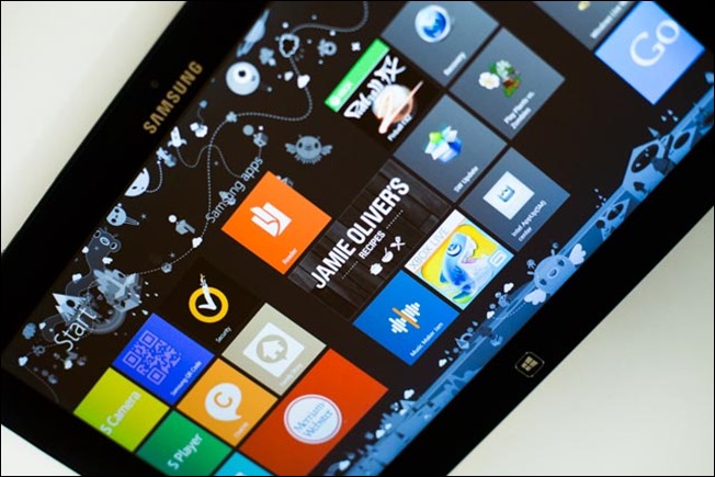
The tablet physically looks quite nice and sleek. To a lot of extent, the styling fits into a ‘generic’ look that you might expect from a Windows 8 tablet.
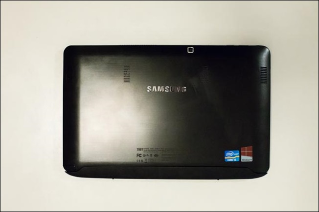
Unfortunately the back is pretty hideous. Aesthetically and built quality-wise, this Windows 8 tablet is far from the quality of an iPad. The fan fins, the FCC, Intel and Windows 8 logo are a bit much for my liking. Even more so, the oversized dock base from the keyboard makes it worse. I really wish Samsung put more thoughts on the design of the device. When attached to the keyboard, this tablet looks more like a Netbook. Remember one of those?
Breaking the leather in
Just like any other Windows 8 PC, you need to ‘break the leather’ a little bit to make it comfortable. I had to change some of the default like the default search provider for IE10 from Bing to Google Search and a few more.
Otherwise, the overall the configuration process is fairly straight forward. It doesn't necessarily require me to plug the device into a PC (unlike the old iPads) nor force me to connect to the internet. However since I enabled the internet connection, Windows 8 successfully transferred across a lot of my Windows 8 settings (like wallpaper, etc.) from the Windows 8 installation I have running on the MacBook Pro.
Microsoft do require me to ‘trust this PC’ to enable more ‘thorough’ settings sync-ing, which involves logging in to the Live/Microsoft website. When I tested this, I find the process to be very finicky. For some strange reason, it picked up another computer's name that I no longer own, different to the one that I actually want to establish trust with. After a couple of (very irritating) tries, it seem to pick up the right name in the end.
The Apps
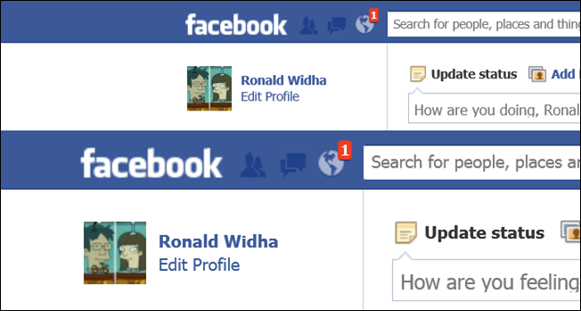
1:1 scale
Above: IE10 desktop resolution
Below: IE10 Modern UI resolution
Browsing experience : Even though this device supports full blown ‘classic desktop’ app, as a tablet I gravitate towards using the Modern (a.k.a Metro) user interface. This means for browsing the web, there isn't really a question to use or not to use the new touch-centric IE10. It's currently the only browser available.
I find the experience to be acceptably enjoyable. Popular websites from Gmail, YouTube to Facebook render properly. The only issue that I'm facing is the seemingly lack of resolution of the images rendered on the screen. This is due to the fact that by default IE10 will try and fit the width of the webpage to the screen. I'm guessing as Windows 8 becomes more popular, web designer might create additional hi-res assets for their webpages just like some do for the iPad retina display (media query standardization please). Otherwise, you could always browse webpages in portrait mode by holding the tablet vertically.
Social experience :Microsoft has been harping about the ‘People Hub’ quite abit since Windows Phone 7. This out-of-the-box app promises to consolidate your social life into one app, as do TweetDeck and other similar apps. It works quite okay, but I find it hasn't quite replaced the experience of Facebook.com (for Facebook) as yet. I find myself going to the the website to check the latest activity updates from my friends than using the People Hub.
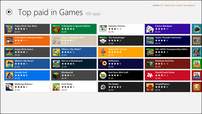
Angry Birds? check. Fruit Ninja? check.
The App Store : The biggest issue of using this Microsoft+Samsung combo is that the ecosystem do not currently provide me access to some of the apps that I rely a lot when I'm on the iPad: the FlipBoards, the Google Maps, etc. Alternatives do exist : but they're really not as good. At least not yet. Say what you say about the skeumorphic design about iPad apps, but they look pretty and mostly work well too.
Reading experience : Like I said before, FlipBoard is notably missing from the Store. But I'm really glad to see that the Kindle app is there. It works as expected. The reading experience is as good as on the iPad but not better than on the Kindle device itself (read: LCD vs. e-ink). With my experience with this device, the orientation detection is very sensitive which almost warrant for a lock on the orientation to avoid grievance. Luckily there's a dedicated hardware button for that on the side.
Music and Movies : The music app works fairly well. The Modern design takes abit of getting used to. I kinda wish they stick with the Zune UI which I was already used to. In some third party app (like the YouTube Player), it also seems that the Screen/power saver do not get automatically deactivated when watching a movie which is a little annoying.
Gaming experience : Angry Birds Star Wars? check. Where's My Water? check. Fruit Ninja? check. I just hope companies like Valve will continue supporting Windows platform and take advantage of the touch capabilities outside the ‘classic dekstop’ mode. The one annoying thing is all your purchase on the Apple's App Store or Google Play will obviously not get transferred across. But this is no different than buying a game for MegaDrive and not being able to play it on the SNES.
What's unique?
Real Multitasking FTW - Multitasking with two ‘Metro’ apps works very very well : this is the one feature I really miss when using the iPad. I fully agree that most of us do 2 things at once. The 1080 HD resolution and a (relatively) fast processor really let me do some real multitasking. It stutter here and there during app switching, but hardly noticeable (more noticeable in the classic desktop mode). And when you do ‘mono’ task, the resolution and processor could be expensed to deliver quite a decent performance for much more than casual gaming.
Share to Any Apps - Not until recent year that iOS embrace Twitter and Facebook on the operating system level. Before that, all apps have to provide integration to these services themselves. Even until now, sharing from apps to Tumblr, Wordpress, Pocket, Pinterest etc. depends on app per app basis.
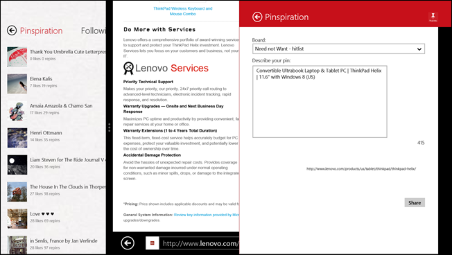
Windows 8 with the Share button speeds up this ‘integration’ process astronomically. E.g. despite IE10 do not allow any plugins, it doesn't stop me from pinning the page I'm on to Pinterest, just because I install the Pinspiration which support Sharing to Pinterest.
The Let downs
Battery life : While the strength so far comes from the Operating system, the issue that I have with this combo is indeed more on the hardware side: first of all, the classic battery life issue. Without a dock, the tablet comes in at a respectable 3 hours. But simply doesn't give me enough confidence to leave the adaptor behind when I'm out and about : something that I normally do with an iPad. Adding to that, I find myself very rarely detaching the keyboard from the Tablet just purely because of the mental baggage ‘I'd get more battery juice if I keep it on’.
Durability :The Samsung ATIV Smart PC, at roughly $1,200, is quite an expensive tablet. Especially compared to an iPad at half of the price. I know it's not an apple to apple comparison (pun intended), but this review is all about treating the combo as an iPad replacement.
If I had to bet on which one of these devices that would age more ‘graciously’, I would put my money on the iPad. The ATIV don't feel as solid as the one-piece metal/glass thing that the iPad is. The ATIV gives me this feeling that the button would collapse and the edges of the screen will snap open if dropped by the two year old.
During the several days of testing, I even have collected quite a bit of scratches and it hasn't gone thorough beating yet by the toddler!
Other Minor Issues : Some more minor issues ranges from the constant auto brightness adjustment that's hurting my eye, to the not-so-very-zen-like keyboard docking. Just forget about putting the tablet on the bed side table as a calendar or alarm clock unless you want to have a netbook like device hanging around the bedroom.
In the next several posts, I'm going to cover the Windows 8 from different angles. Stay tuned
Part 2: The Windows 8 ‘uber-laptop’ experience : coming soon
Part 3: The Windows 8 ‘creative nomad’ experience : coming soon
Worthy review. More insight than tech media. On ageless design -- why do device manufactures design such shitty hardware for Windows?
if you go for one of the Windows RT devices you get great battery life while still retaining high level of functionality. However I do agree the application writers need to get on Windows band wagon as it's very poor at the moment :/
Thank you for providing such information. This is very generous of you providing such vital information which is very informative.
Hi, I hope that you will get the best tablet reviews of the universe from here.besides, here you will get special discount by buying any tablet.for more details please visit here Thank you https://whattabletisthebest.com