Microsoft Web Camp: Creating Cutting Edge Websites for Phones, Slates & Beyond
Zubair and I had the chance to present at the Microsoft Web Camps last April 16. We covered two topics: I did Responsive Design, and Zubair focused on WebMatrix and Visual Studio 2010. If you miss it, feel free to watch the video!
The process of creating a website now always start with a question on figuring out the devices you want to support for; PCs, mobile phones and/or slate devices. Each of these devices may have different screen sizes, capabilities etc. For simplicity, designer/developer often chooses to build dedicated websites for each one of the platform which often leads to maintenance nightmare.
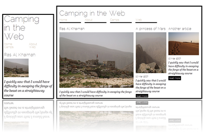
This talk showed how to design and develop a dynamic website for the various platforms using Responsive Design techniques. We're starting up the process with WebMatrix and transitioning to Visual Studio 2010 as we progress. We touched on Html5, CSS3, Razor, Entity Framework 4 and C#.
Here's the slides that I use on the day:
Here's the sample website that we build/explained on the demo. And of course just right click and ’˜view source' (or use F12 tools/Firebug) if you want to explore the source code:
