7 things I don’t like about RockMelt
After using it for a few hours today, here are the 7 things that annoys me about RockMelt
#7 Doesn't exchange tabs with other Chromium browsers : well, Chrome
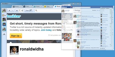
I wish I can snap on tabs from Google Chrome and back.
#6 Yet another List?
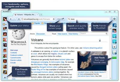
The Friends Edge shows all your Facebook friends vertically. Since it won't probably fit everyone in there, RockMelt fortunately (read: sarcastic) allows you to create a list of your favorite contacts.
What the heck!???
Why don't just somehow associate a Facebook List? or Twitter List? Why re-creating another notion of a list when there are perfectly good ones out there?
#5 Ctrl + Shift + Arrow doesn't select a word but slides the Edges instead
If you're on the Url bar at the top, pressing Ctrl + Shift + Arrow doesn't let you select the text per words, but slides the Rockmelt's Edges instead. Which is kinda annoying.
#4 Search from the url bar doesn't honor Google's NCR Cookie
Google.com redirects to the local version. It's a nice feature when you’¦speak the native language. For us expats, there's a handy tip to get around this which is to hit https://www.google.com/ncr at least once. From that point on, we will never get redirected to the local version. NCR relies on a certain cookie to be present, and eventhough Chrome url bar honors this cookie when you do searches, RockMelt doesn't.
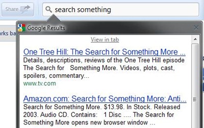
#3 Who uses the search bar these days?
No Chrome users uses a search bar anymore. Soon ie9 users will get into the same habit of just simply using the url bar. Plus, Google already has instant result anyways, so we don't need’¦well..that.
What I would like to see though is Google instant result appearing as I type things on the Url Bar, that'd be super cool.
#2 The UI's is so cluttered
My biggest beef about RockMelt is how cluttered the UI is. It doesn't come across as a well thought of UI.
The left Edge : shows all my facebook friends. Just their photos. So in reality, you can never tell who they really are until you hover over or click on the photo. I would probably never drag drop a link to a contact before double checking that it's the right person.
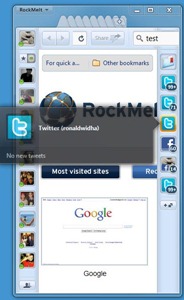
The right Edge : shows all my news feed, from Facebook, Twitter to RSS. The problem with this is, one has to click to actually see the content. It reminds me of IE8 WebSlices which never quite work for me.
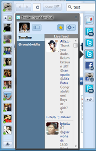
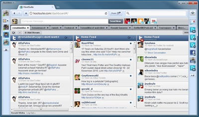
Solution: I would prefer for RockMelt to have a tab where I can see all my feeds in a glance, just like HootSuite, TweetDeck and others. Easy access to get to this tab will be handy
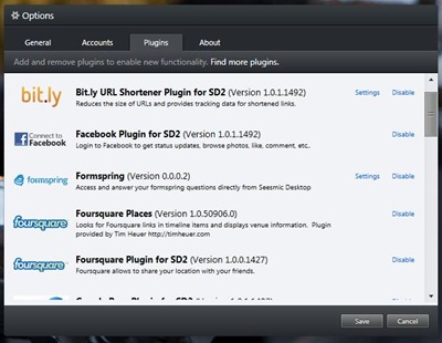
I think RockMelt should also take a chapter or two from Seesmic Desktop 2 by letting the public to build plugin to enhance the feed tab/view. It kinda already does a little bit through the App Feed, but would love to see it be taken further.
#1 Slap on integration
The number one most annoying thing about RockMelt is it's Social integration. Most of the social integration in RockMelt currently is still fairly shallow. One can share links by dragging dropping to the contact, shout out a status update, consume feed ’¦and it feels like that is it.
I want my browsing experience to be even more integrated. Real time surf with your contacts, share semi public bookmarks with your facebook list members, show related activities of a webpage and I've just started with the obvious ones : I'm sure you would be able to easily add more ideas into this list.
RockMelt as its current state is far from what the tag line seem to suggest, ’˜browser re-imagined'. It can't yet replace opening up Facebook.com, Hootsuite, mail ’¦ and suddenly RockMelt just becomes another regular web browser.
What do you wish RockMelt could have done differently? or do next?

One thing I don't like is it's name!
Your opinion about this application seems to me kinda superficial. Don't you see all the good stuff the producers put in there? Of course there several things that they have to change - and I really do believe the search bar is one of those things mentioned- but do you really think that's surprising at this time (I got the 0.8.36 version of it!).
So did you ever use Flock? I loved it for some of the reasons you mention but it was such a hog. I happen to like things off to the side but think the multiple column option might be nice on the click through. What I hate is that many of the extensions I use from Chrome have been glitchy but since I've only been using the browser for a couple of days, I might have a bit more to say soon. Also, I hate that the chat feature can't be turned off on Facebook in the browser--or am I missing something?