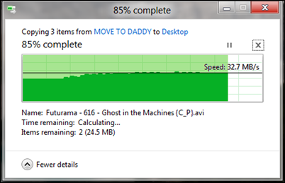
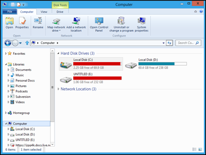
What will be introduced in Windows 8 Consumer Preview? Hopefully … the Metro theme on the Classic Desktop
Updated 1st March 2012: Last night Dubai Time, Windows 8 Consumer Preview was launched : and I am dead wrong. No Metro theme on the classic desktop in sight. Hopefully this will be added in last minute on the Release To Manufacture version
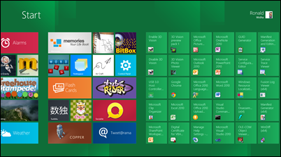
Most people who have tried the Windows 8 shared the same sentiment that the difference between the ‘classic Windows Desktop’ and the new ‘Metro Tiles" start screen is too jarring.
So I thought I want to share my (hopeful) conviction that this may change in the upcoming Windows 8 Consumer Preview release on the 29th Feb.
Here are some hints as seen on the Windows 8 Developer Preview to why I think this will change in the next version.
The Flat ’˜Windows Logo'
First thing that you'd notice is the new ’˜Start' logo on the bottom left. It has a flat grey background with and also a matte version of the Windows' flag logo.
I actually like this logo better than the new 2 point perspective Windows logo

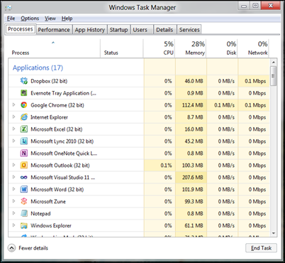
The Flat new ’˜Windows Task manager'
One of the new utility that was introduced in the Windows 8 Developer Preview was the new task management. As you can see, gone are the embossed 3D edges and replaced with clean lines. No more gradient glass feel of the aero theme.
The flat chart on the ’˜Copy Dialog'
Another new utility that was added in Windows 8 Developer Preview is the new copy dialog. The same styling principles is also applied here.
The flat Modal ’˜Windows SmartScreen' Modal Dialog
This is probably one of the boldest change in Windows 8 Developer Preview. The new modal dialog removes the concept of ‘window’ and simply block the screen as a whole.
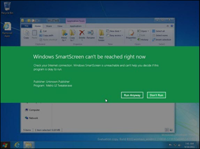
picture from technospot.net
The Flat ’˜Windows Classic Theme'
If you turn off aero and switch to classic Windows theme, I can definitely see strong metro influences on the window styling: border, scroll bars and the close/maximize buttons look very much flat with little 3D effect. Just clean lines.
Obviously the good old ’˜Zune'
The Zune Windows app has been around for a while. One could argue that this was the time that Metro style was conceived. My guess is Microsoft will adopt this styling more and more on all their upcoming applications.
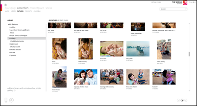
The flat upcoming ’˜Office 15' theme
Along with the Windows on ARM, new Windows Logo announcements, Microsoft also show a few glimpses of the upcoming Office 15. It looks like Microsoft has taken on more of the Metro / Zune type of styling on this application too.
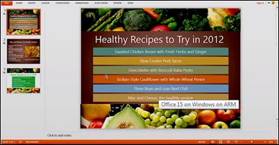
picture from betanews
Even Visual Studio 2011's ’˜TFS Check In' and ’˜Find' dialogs
Looks like the change in style direction will be reaching out to not just the consumer driven app but also development tools like Visual Studio.
The fact that Microsoft is brave enough to introduce a change that isn't just purely cosmetic, but also effect on how the professionals do their work; proves that this shift will be pervasive across the different Microsoft products - just like the introduction of the ribbon (which is introduced in Office and adopted across Office suite products including SharePoint, Windows Live Products and now also Windows Explorer).
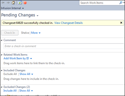
Check out the new TFS pending checkin dialog and the new search dialog! I wouldn't be surprised if the Metro styling would make its way to the server products too.

I haven't been excited about a Windows product since the launch of Windows Azure, but looking at what might be coming in the next few days : I can't help to feel very excited to see a typography driven Windows UI.
